Introducing In Progress
Each year, Manchester School of Art invite an alumnus to create our end of year show identity and this year Interactive Arts graduate (2009) Aliyah Hussain was commissioned to create our show brand.

Aliyah Hussain’s practice approaches themes found within feminist science fiction literature, in particular the possibilities of co-sharing space in domestic or social settings. She works with abstract forms and uses these to construct narratives in order to explore different modes of communication and miscommunication.
With a background in performance and an interest in process and material, her work moves across sound, ceramic sculpture, drawing and collage.
As Aliyah explains, the concept for the show began in early 2020 before being developed during and in response to the lockdown.
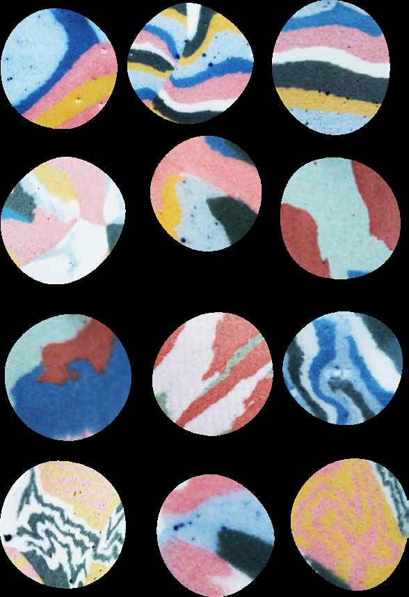
“My original concept proposed a series of ceramic tiles created using the agateware process. A technique in which various colours of dyed porcelain are subjected to different marbling processes to create an effect that mimics the patterns found in metamorphic rocks and minerals. The intention was to take the idea of process and make it visible. The surfaces of the tiles would represent the student experience of going through art school, highlighting and making visible the processes they learn and execute in their work and the process of growth and change as they become skilled in their chosen creative areas.”
“Taking cue from the metamorphic process I came up with a formula to explain this:”
TIME + PRESSURE + EXPERIENCES = ART SCHOOL
After the lockdown and without access to her studio, Aliyah began to reimagine what this concept could look like.
“The shift to ‘In Progress’ acknowledges this moment of changed plans and the need to adapt to new ways of making and expression as well as the
possibilities that come with it.
To adapt the work to this moment of COVID-19 and restricted access to resources, space and equipment that would normally facilitate the processes of making work I’ve developed the work digitally instead of analogue (ceramics) and adapted the formula to create a system that would work for the visual representation of the branding.
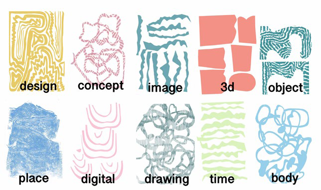
I identified a list of themes that cross over the courses and when combined, build up the identity of each course. Each theme is assigned to a drawing/
collage and then layered to create a digital illustration of a ‘tile’. That tile then becomes the identity for that course, for example:”
DRAWING + IMAGE + DIGITAL = ANIMATION
“For the main image to be used across the entire branding I’ve taken a list of themes that cross over and incorporate the 15 courses to create one
tile that will act as a unifying image.”
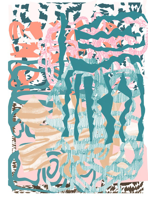
TIME +
DRAWING +
DIGITAL +
BUILD +
IMAGE +
OBJECT +
DESIGN +
PLACE =
MANCHESTER SCHOOL OF ART
“The colour scheme is inspired by student work from the Interactive arts. I visited the studios and asked the 3rd years to take pictures of their work
in progress. I then selected a series of images from the student work to draw the colours from. Work chosen is by Jina Lee & Amina Khan.”
To sit alongside Aliyah’s artworks, an IN PROGRESS identity has been
created by graphic design alumni Jake Beddow. The concept of a fluid, changing identity is to invoke the idea of feeling ‘in progress’- not being
afraid to change creative decisions through having to adapt to new situations. Where possible, the font will evolve and change through animation.
A modified typeface has been created for the course titles inspired by
geological references supplied by Aliyah. The addition of angular, crystal-like letterforms to Bergen Mono give each course title a dynamic & contemporary feel – aiming to echo the raw element theme of Aliyah’s concept.